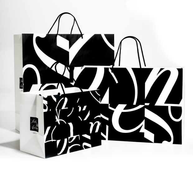
 Bierut took the Sak’s Fifth Avenue logo and redesigned it. After 30 years it wasn’t enough to redesign the logo. It had to have some resemblance of its former self with a redesign that brought it to the present and pushed it into the future. That is what Bierut did by dissecting the logo, rewriting the cursive, and placing it in 64 boxes on a grid that could be shuffled into an infinite amount of different looks. Type is at the root of many of his works and he never uses it the same way twice.
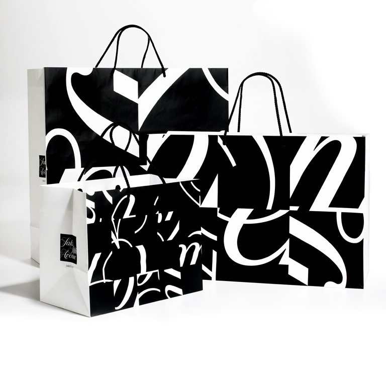